The Corporate Design of the
Robert Bosch Stiftung
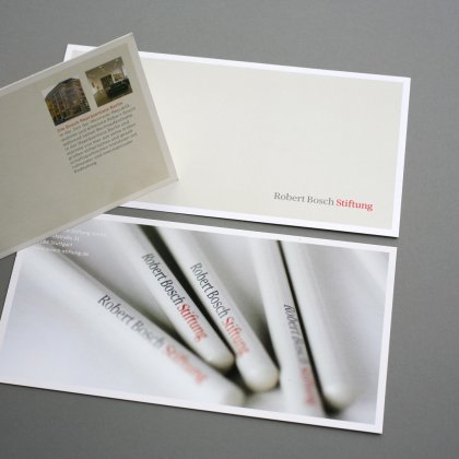
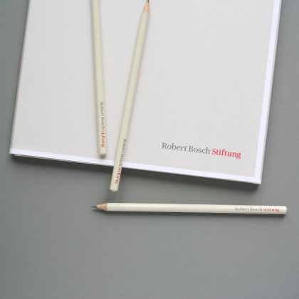
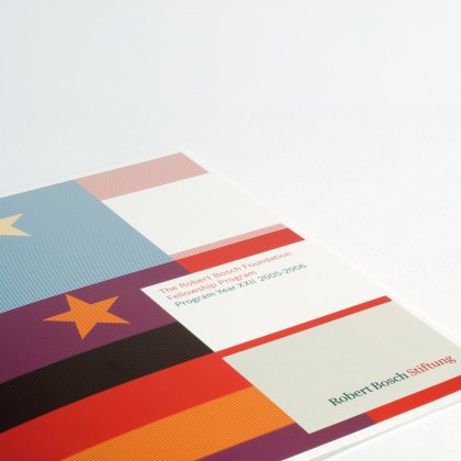
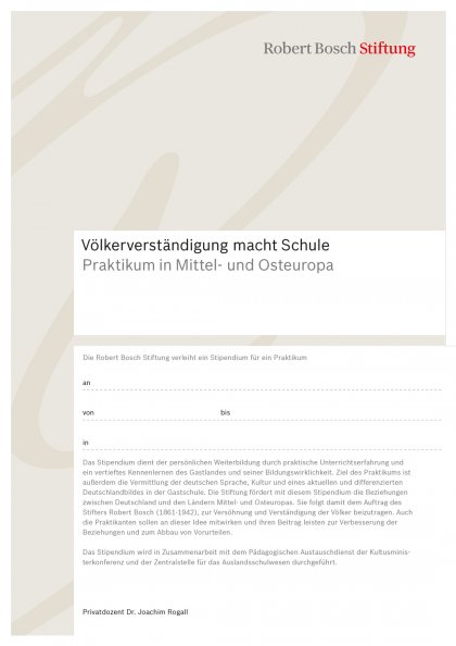
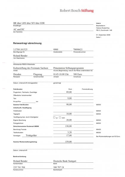
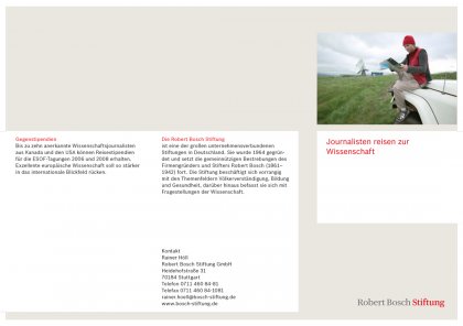
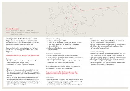
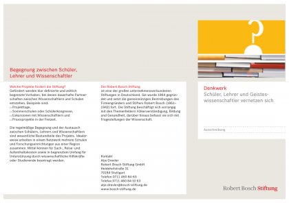
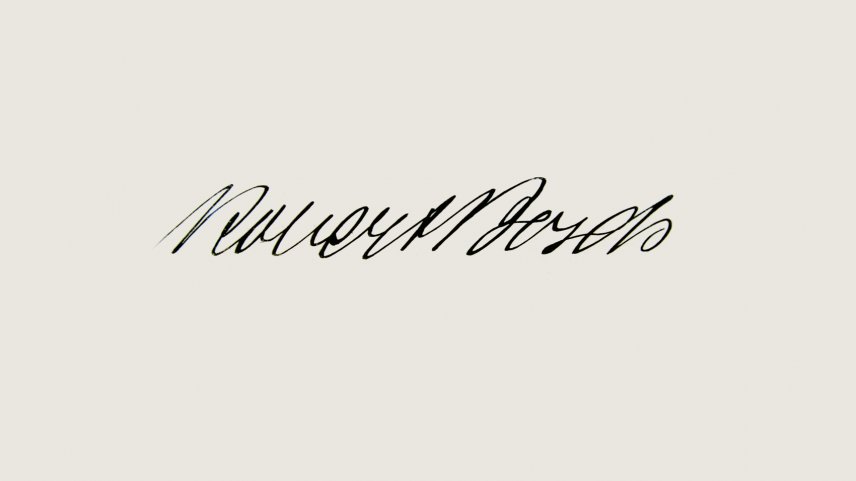
The new logotype of the Robert Bosch Stiftung is based on the long time grown values of its founder Bosch. Colors and type are lent by the public brand. Nevertheless the new logotype of the foundation is pointing out its special mission and autonomy. The upper and lower case as well as the accentuation on »Foundation« are new. The design abandons any acrobatics, but is underlining the social relevance. The new notation and colors are drawn from life. The complete corporate design has been redesigned.
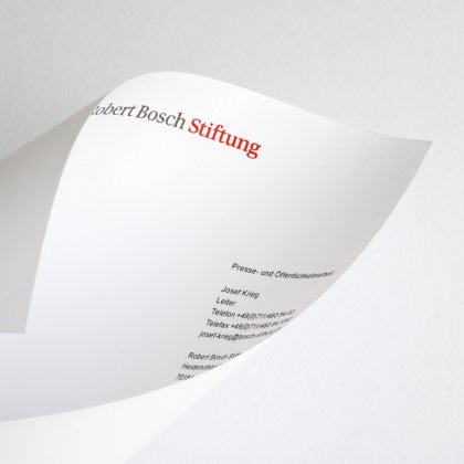
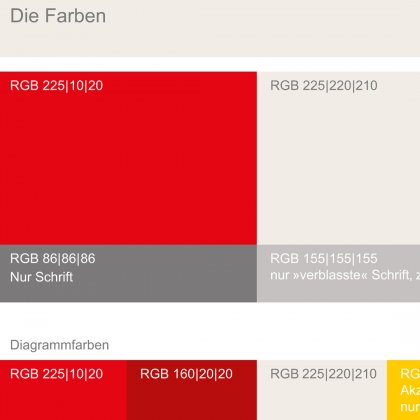
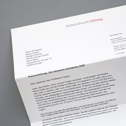
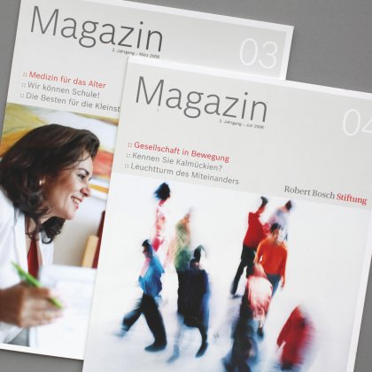
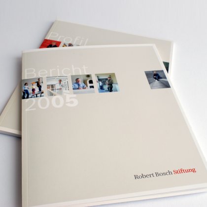
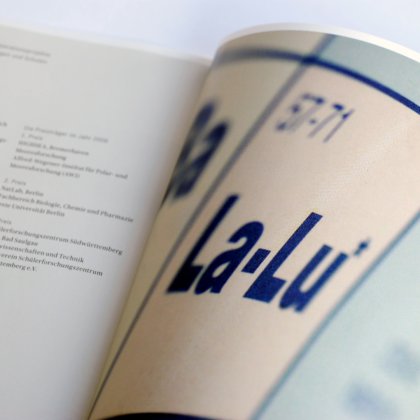
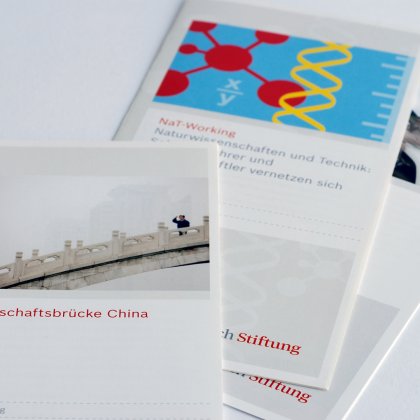
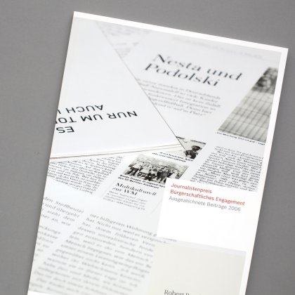
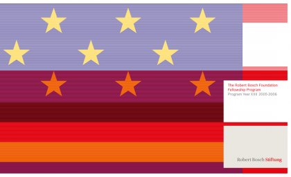
Most characteristic are the types »Bosch Sans« and »Bosch Serif«, that has been developed especially for Robert Bosch, as well as the colors red and warm grey. Next to the color positioning the literature system has been adapted. A flexible modular system allows to connect single publications without compromises concerning the content. Function and information quality have been optimized. The atmosphere of the media seems clear, independent and committed to the content, totally in terms of the founder Robert Bosch.
